Increasing consistency and development speed with a unified Design System
eSpark Learning, 2024 • Team Lead & Designer • 6 Months to initial launch
2 Designers, 3 Engineers
Complex, fragmented and frustrated…
As eSpark scaled, our product surface expanded across multiple teams, features, and platforms. As the principal product designer, I began to see the cost of this growth firsthand: designers were reinventing patterns, engineers were building UI from scratch, students and teachers were experiencing subtle but meaningful inconsistencies across the product.
To solve this, I founded and led the creation of eSpark’s unified Design System and Component Library. My goal was simple: create a shared visual language and a scalable set of components that increased team velocity, improved product coherence, and gave students and teachers a more consistent, accessible experience across every eSpark product.
Laying the groundwork
I led a series of cross-functional workshops to lay the groundwork for building the Design System and Component Library.
Audit of existing designs
We started by conducting a comprehensive audit of the existing UI components, styles, and design patterns across all products. This involved documenting every visual element, including buttons, forms, typography, colors, and layout grids.
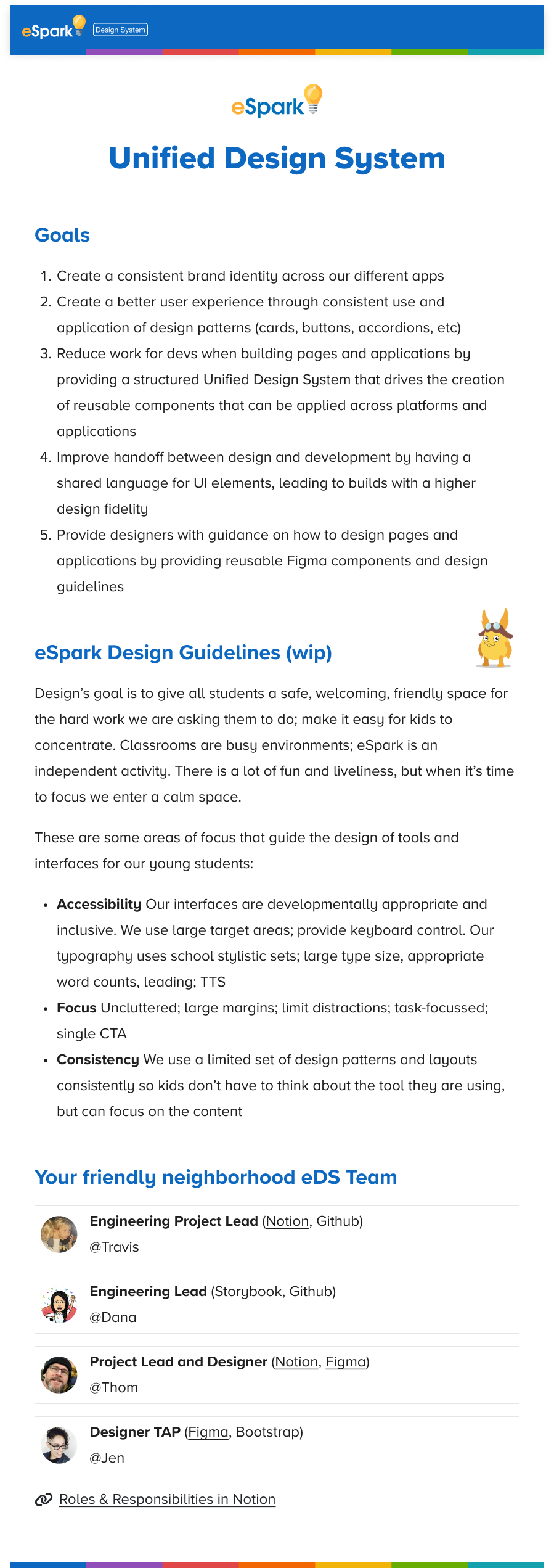
Align on goals
I drafted goals and made sure the team was aligned on them, to make sure everybody understood what we were trying to accomplish and why.
Design guidelines
We agreed on 3 basic, student-centered design principles to support and guide building and expanding the visual design system:
Accessibility Our products serve users from age 4 to 65 with a variety of abilities and limitations. Our system needs to accommodate all of them.
Focus Classrooms and teachers lounges are a loud and busy environments. Our interfaces should be uncluttered and free from distractions from the task at hand.
Consistency Students and teachers should not have to relearn how to use eSpark with every new feature or product.
Building the Design System
Style guide
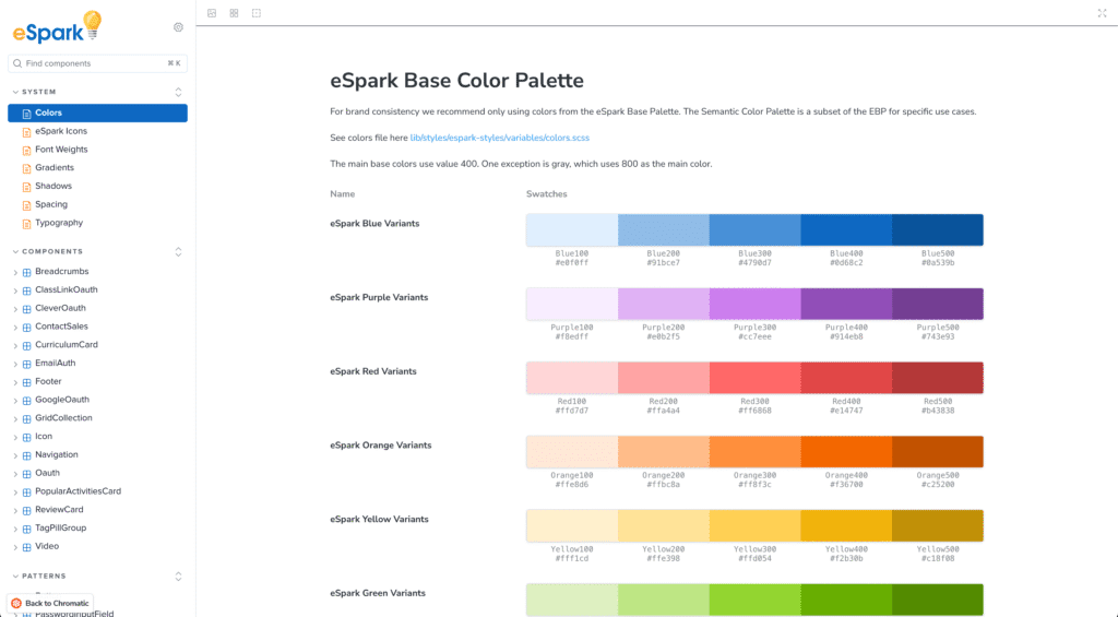
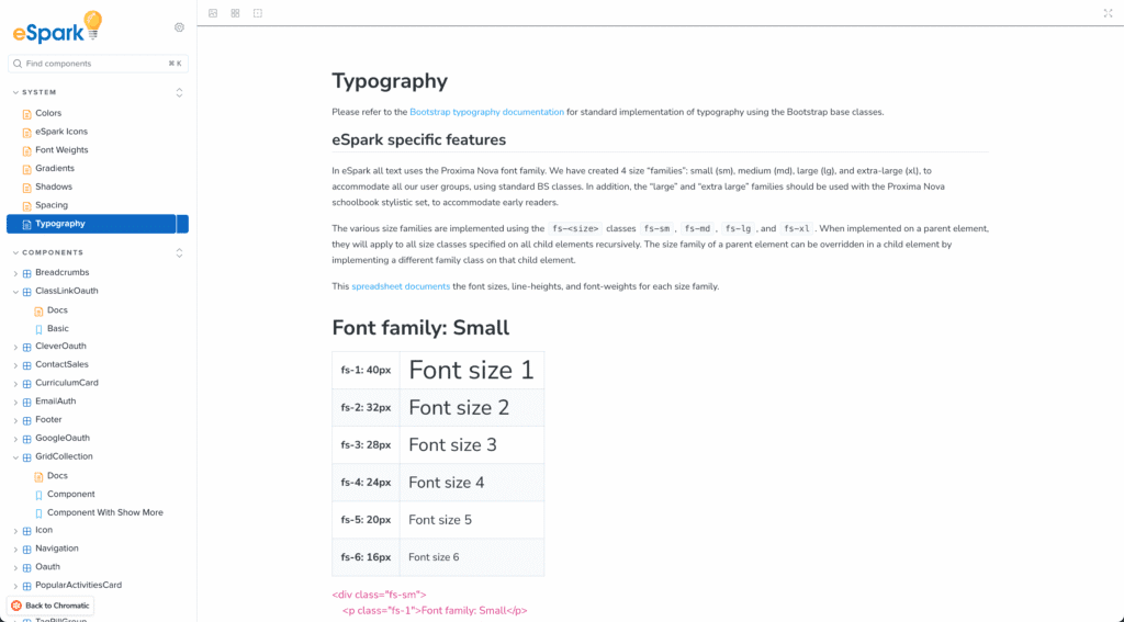
The first step was creating a comprehensive style guide in Figma. This included defining styles and tokens for brand colors, typography, spacing, shadows, and icons. These elements became the foundation of the design system.
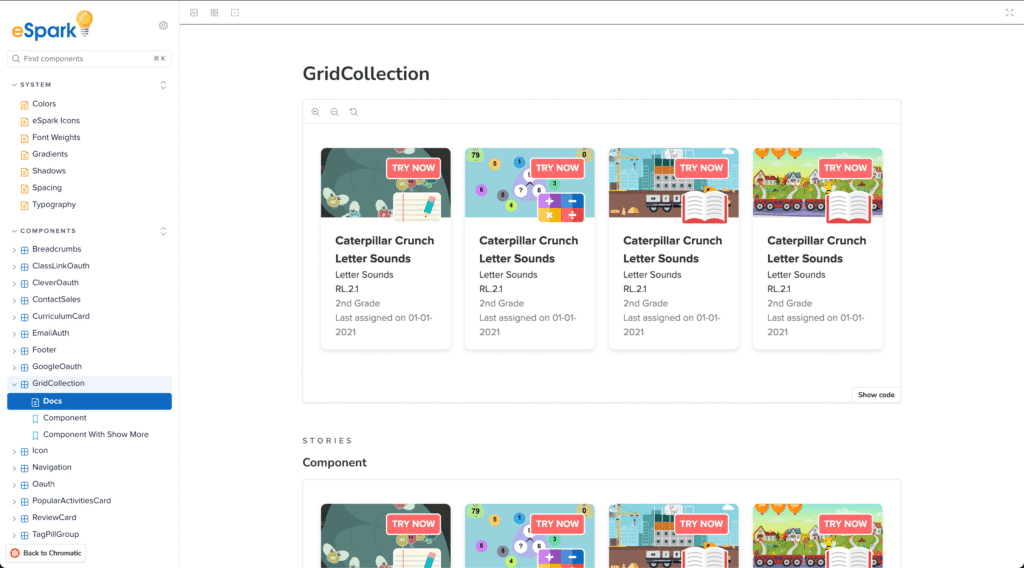
Component Library
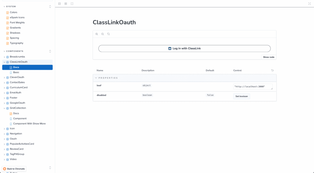
We created a reusable Component Library in Figma and Chromatic. Each component (buttons, input fields, cards, etc.) was designed with states (hover, active, disabled) and variants (sizes, colors) to account for different use cases.
Documentation
We documented every component and pattern including guidelines on when and how to use them using Storybook, Figma and Chromatic. This documentation ensured that both designers and developers could quickly reference the same source of truth.
Growing the system
We didn’t want to wait until all elements and components were finalized to start using the system. I created a simple versioning system using Notion and Slack to communicate and implement changes to the Design System
Results!
Consistency
The design system significantly improved visual and functional consistency across the product. With unified styles and reusable components, users experienced a more cohesive journey throughout the platform.
Scalability
As new features were added to the platform, the modular design system allowed for seamless scaling. New components could be introduced without disrupting existing ones, and the system remained flexible enough to adapt to future needs.
Efficiency
Designers and developers saved time by reusing pre-built components, reducing redundant work. This accelerated the product development cycle and allowed teams to focus more on innovation rather than reinventing common UI patterns.
Improved User Experience
Users benefited from a more consistent, intuitive interface, improving engagement and satisfaction. The integration also streamlined content management for marketing, reducing dependencies on developers and accelerating workflows.